Here's a deck I did recently. I think the video says it all.
WELCOME
The featured project page of Kevin Smith, Carpenter
Sunday, January 30, 2011
Sunday, August 22, 2010
You're gonna have to visualize on this one... The porch was already there, there was a flat roof with a cedar deck on top of the screen porch, and the window above was a sliding door. Of course, when the roof leaks horribly, it's not so much fun to have such a thing on your house. So, we took off the deck, replaced the door with a window, replaced the rotten wood trim with composite trim, pitched the roof and put metal on it.


Saturday, May 22, 2010
Sunday, March 28, 2010
 Here's an exterior custom trim job on the New Hampshire seacoast. Above you see the before, below you can see the after. The client felt (and they were right) that the entryway didn't make a statement, didn't fit the house and wasn't very well built as well. Notice the new window head casings on the lower windows that provide more overall detail.
 Here you can see the differences more clearly. We changed the round pad to rectangle, two posts to four, round portico to rectangle, built the rubber roof properly, installed a different window and tricked it all with a LOT of composite trim. Now the entry is properly sized for the house, detailed enough to provide interest, the window fits the house, and best of all.... the roof doesn't leak.
 We also spiced up the side door as well. Again, the roof was designed in keeping with the overall style of the house in mind. It fits.
 Below is the inside trim. A barreled ceiling is no small task... at least when raised panels are involved.
 Here is the inside of the new window. The wallpaper was recently installed, so I had to be careful not to damage any of it while changing the window opening. Notice the barrel ceiling below the window for reference.
 The house originally had site made dental moulding... not very attractive. So we changed it to a two part crown with Cor-AVent soffit vent material. This special vent material allows me to install a detailed trim without the unsightly metal vent that is so common, while still venting the roof properly. Look carefully, it's the blackness between the white of the soffit trim and the main house color.
Monday, January 18, 2010
This is a locker unit for the entryway, every family member has one section. Drawers below, shelves and coat hooks above.

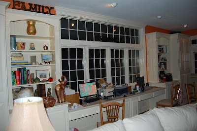
This is a desk/shelving/pantry type project. There is a computer tower cabinet in the middle, with desk space all around, then to each side there are adjustable shelves above with cabinet space beneath. Then on the very outsides, there are two large pantry type cabinets, one with hangers for jackets, the other with pull out shelving for storage.
 The view from way-back. PS- I also did the hardwood floor...


This is a desk/shelving/pantry type project. There is a computer tower cabinet in the middle, with desk space all around, then to each side there are adjustable shelves above with cabinet space beneath. Then on the very outsides, there are two large pantry type cabinets, one with hangers for jackets, the other with pull out shelving for storage.
 The view from way-back. PS- I also did the hardwood floor...
Tuesday, November 03, 2009
Sunday, November 01, 2009
Subscribe to:
Comments (Atom)


